In a lean business problems should be solved as they arise. It is important to fix the root cause of the problem, not simply the symptom of the problem, to ensure that the problem will not simply re-emerge in a different form. This means that all staff should be familiar with some simple root-cause analysis techniques. Here we will look at three: Five Whys, Fishbone diagrams and Pareto charts.
Five Whys
Simply ask why something is happening. If the answer isn't a root cause which can be addressed, ask "why" again and keep doing so until the root cause is found. This may require fewer or more than five rounds - there is nothing magic about the number five.
Example
| Level of Problem | Corresponding Level of Countermeasure | |
|---|---|---|
| There is a puddle of oil on the shop floor | Clean up the oil | |
| Why? | Because the machine is leaking oil | Fix the machine |
| Why? | Because the gasket had deteriorated | Replace the gasket |
| Why? | Because we bought gaskets made of inferior material | Change gasket specifications |
| Why? | Because we got a good deal on those gaskets | Change purchasing policies |
| Why? | Because the purchasing agent gets evaluated on short-term cost savings | Change the evaluation policy for purchasing agents |
Source: Peter R Scholtes, The Leader's Handbook, McGraw-Hill, 1998
While there is a 'fix' at each level, it is only at the last level that the problem can be solved completely.
Fishbone (Ishikawa) diagrams
In more complicated situations it may not be clear what the cause of the problem is. All potential causes must be considered and eliminated, leaving only the actual cause. To surface the full range of possible causes a fishbone or Ishikawa diagram is used.
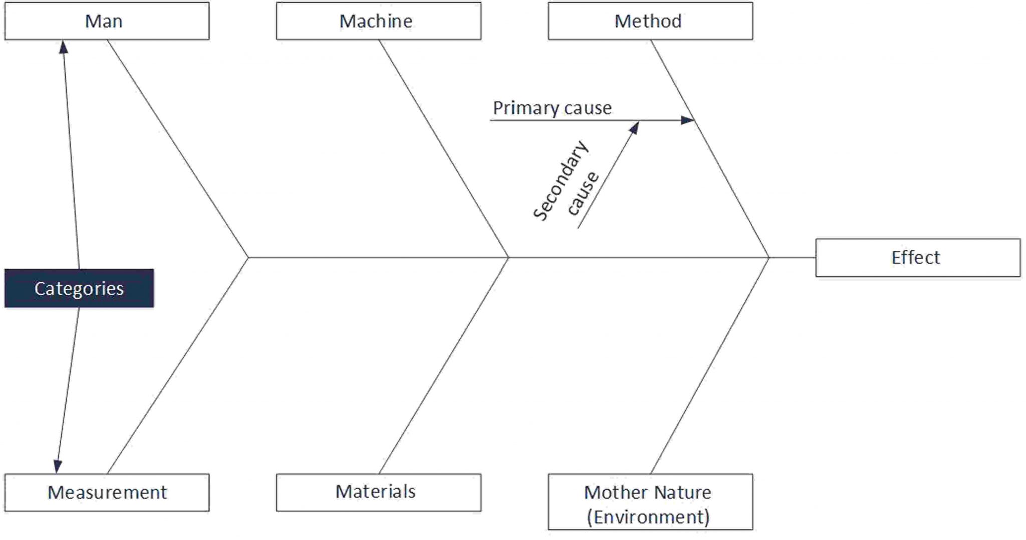
At the'head' of the fish is a statement of the problem - the effect whose cause is being sought. At the ends of the 'bones' are the possible cause categories. In this example we have used Man, Machine, Method, Measurement, Materials, Mother Nature (Environment) (the Six Ms) , which is suitable for production environments. In a service environment the Four Ps ( Policies, Procedures,People, Plant/Technology) are often used as an alternative. Along each 'bone' are the possible causes and attached to these are possible secondary causes. The idea is to think of all the possible contributors to an effect to ensure that none, however unlikely, is overlooked.
Having completed the diagram, experiments should be devised to determine the extent of the contribution of each identified cause to the effect.
Example
At a chemical plant the quality of one product was varying unacceptably. A fishbone diagram was drawn up and 'The Weather' was entered as a possible cause on the Mother Nature 'bone'. To eliminate this, air pressure and outdoor temperature were recorded for each batch and were surprisingly found to be responsible for all the variation in product quality. A 'Five Whys' then revealed the cause to be varying concentration of an aqueous reagent due to temperature dependent solubility. Bringing storage of this reagent into a temperature-controlled area solved the problem.
Pareto charts
Pareto's Law or the 80/20 rule was discovered by Italian economist Vilfredo Pareto when analysing the distribution of wealth among the Italian population. He discovered that 80 - 90% of Italy's wealth lay in the hands of 10 - 20% of the populations. This sort of distribution is frequently observed in many fields: 80% of defects will arise from 20% of causes; 80% of complaints will come from 20% of customers.
The technique of arranging data according to priority or importance is known as Pareto Analysis and is an important tool in identifying priorities for improvement.
- First, a factor must be chosen for analysis. For example, if the analysis is to determine how to reduce losses due to scrap materials, one might look at causes against value of loss or against frequency of loss (it would be wise to look at both).
- List all the elements which might contribute to this factor: it is important to ensure that all possible contributors are listed to avoid prejudging the outcome - use a Fishbone diagram.
- Measure the elements against the factor.
- Rank the elements.
- Create cumulative distributions.
- Plot the Pareto curve.
Example
The example below plots the frequency of rejection of batches of a dyestuff against causes of rejection.
| Reason for scrap/rework | Frequency | Cumulative Frequency | Cumulative Frequency as % of total |
|---|---|---|---|
| Excess insoluble matter | 32 | 32 | 40.00 |
| Moisture content high | 23 | 55 | 68.75 |
| Low melting point | 11 | 66 | 82.50 |
| Dyestuff contamination | 4 | 70 | 87.50 |
| Conversion process failure | 3 | 73 | 91.25 |
| High iron content | 2 | 75 | 93.75 |
| Phenol content > 1% | 2 | 77 | 96.25 |
| Unacceptable absorption spectrum | 1 | 78 | 97.50 |
| Unacceptable application | 1 | 79 | 98.75 |
| Unacceptable chromatagram | 1 | 80 | 100.00 |
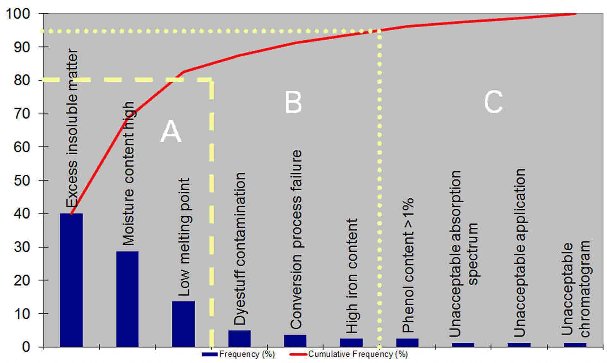
Example data taken from Statistical Process Control, John S. Oakland, 1986
The items in the area marked 'A' are responsible for more than 80% of the batch failures. Once these are fixed, attention moves the the 'B' failures. 'C' failures should only be addressed when all the more important failures have been remedied.
Note that while this analysis establishes priorities for the reduction in frequency of scrapped batches, it does not tell us, for example, whether this is the best approach for reducing the costs of failure. The analysis must be done again with cost, rather than frequency, data to determine this.
More techniques
Thee are many more analysis techniques available: contact Sherpa Consulting to learn more.