Understanding the terrain - process mapping
Before attempting to improve a process it is important that the current process is properly understood. A process map is the ideal tool for sharing and understanding process knowledge. It is used in three distinct phases of process improvement:
- To clarify and understand the current process
- To develop and communicate the improved process
- To document the new process, providing a reference and training tool.
Methodology
Process maps are best drawn by groups of people who actually carry out the process. Do not rely on managers or supervisors – they will know how the process is supposed to be done or how it used to be done, not how it is done now. Charts should be drawn where everyone can see them. Try covering a wall with lining paper from the DIY shop. Encourage other staff to view and comment on the maps, annotating and correcting them if necessary. Don’t commit to something on a computer or in print until you are sure that the map is reasonably correct.
Once the current state map is agreed, use the same process to draw the future state map. There should by now be lots of ideas for improvement. Encourage people to look for problems with the new process to make it as robust as possible.
Finally commit the map to a distributable form, on paper or in an electronic format. Visio is a good tool for this, although there are many specialised mapping applications available. The future state becomes the current state once it is implemented – start looking for further improvements.
Types of map
There are many types and styles of map. There is frequently a trade-off between the semantic richness of the notation used (the ability to convey a lot of information in a small space) and the ease of understanding of the map for non-specialist staff. Examples of semantically rich notations are the Business Process Modeling Notation (BPMN) and the Value Stream Mapping (VSM) notation widely used in lean manufacturing. Both these notations require significant training both to create and to understand the maps – the BPMN specification, for example, is 496 pages long. While these notations are useful, for many situations a simpler notation is more appropriate. We will look at a value stream mapping and three simpler notations: the basic flow-chart, the swim-lane diagram and the Universal Process Notation (UPN).
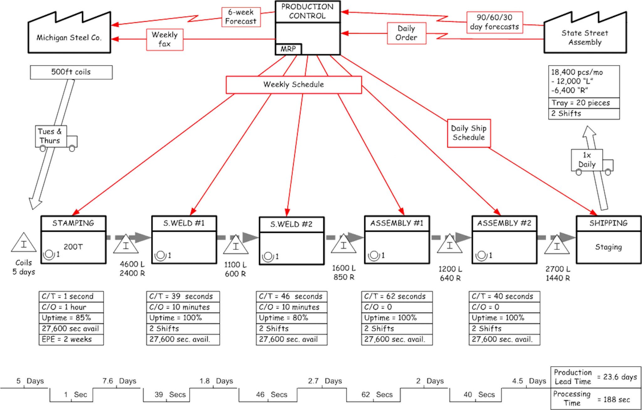
Value Stream Mapping
The value stream map captures all the essential details of a process: material flows, information and control, inventory, process time, set-up time and, crucially, value added and non-value added time. The current state map documents the current state of a process and reveals where the process is most in need of improvement. A future state map can then be created documenting the proposed improvements.
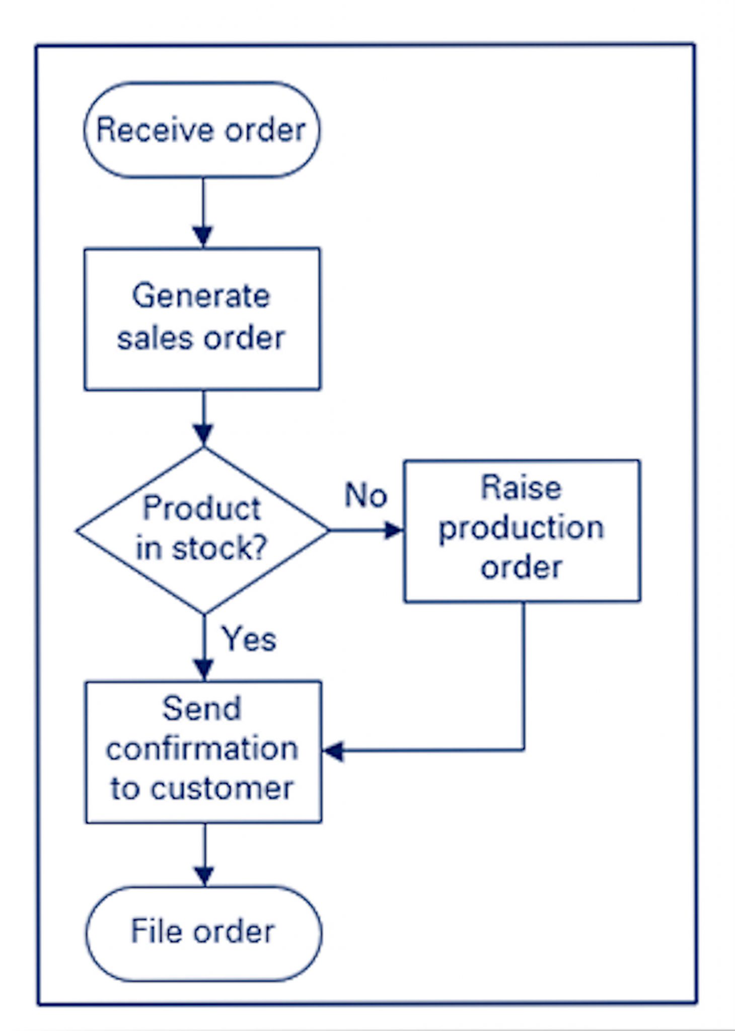
Basic flow-chart
The process-flow diagram uses three simple shapes:
- A rectangular box to indicate an activity
- A diamond-shaped box to indicate a decision
- A rounded box to indicate the start or end of a flow
Arrows indicate the direction of flow within the process.
The basic flow-chart is simple and easy to understand, but is limited in the information it can convey. It is useful when a process is entirely within the span of control of one department. Where a process crosses departmental boundaries a swim-lane or UPN diagram should be used.
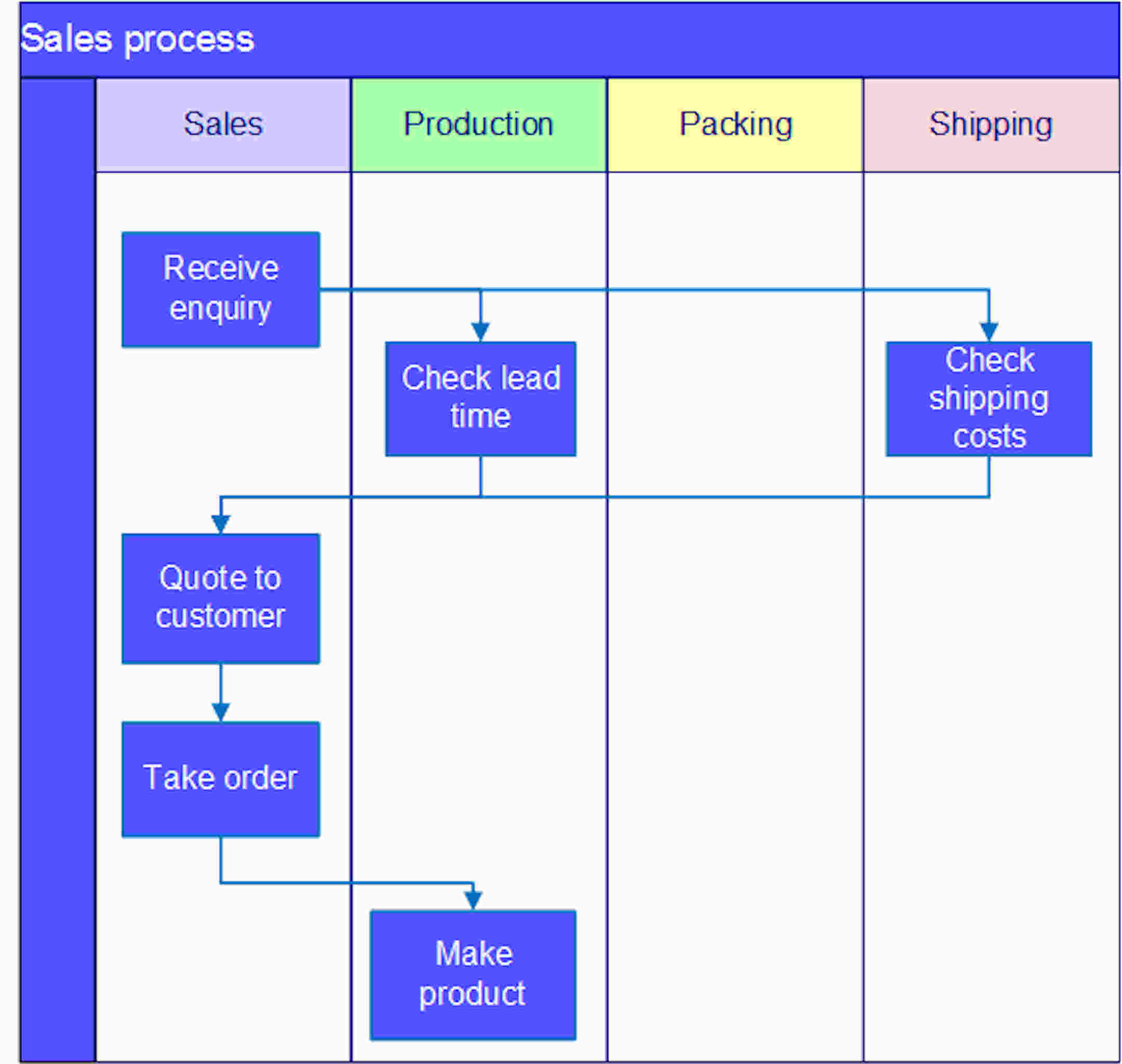
Swim-lane diagram
A swim-lane diagram adds information to a basic flow chart by placing the chart over lanes representing departments. This illustrates graphically the movement of information or materials between departments and highlights the potential for delay at each hand-off.
Both basic flow-charts and swim-lane diagrams can become very long and involved, running over many pages. While the detail is clear, the overall flow of the process may become difficult to read. This problem is addressed by Universal Process Notation, developed by Nimbus Partners for their Control process mapping and management system.
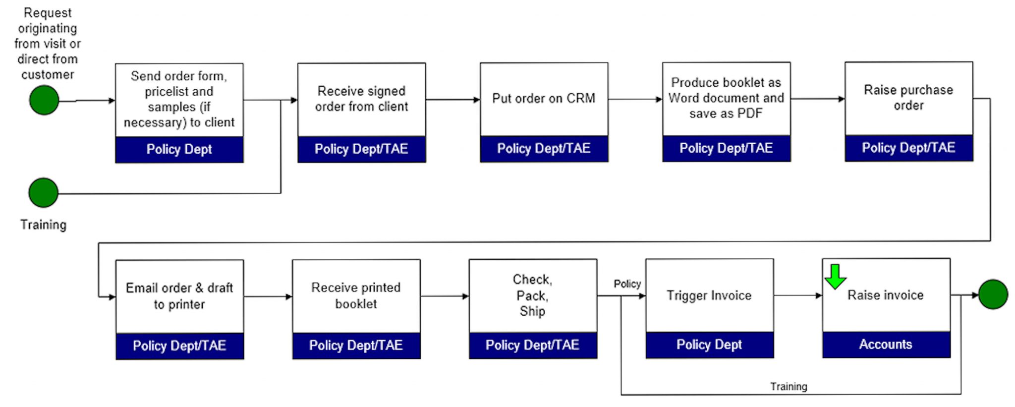
Universal Process Notation
Universal Process Notation (UPN) addresses the complexity issue by summarizing complex activities with a single activity.
A process is represented by a network of activities which may be summary activities, indicated by the green “drill down” arrow, or basic activities with a resource assigned. For each activity, comments and documents can be attached using hyperlinks. The notation was designed for use with the Nimbus Control application, but a limited version can be implemented using Visio and distributed as HTML files.
Other maps
These are just a sample of the many ways of mapping processes. Sherpa will help you to choose the most appropriate mapping methods for your processes.
Data mapping for GDPR
The new EU General Data Protection Regulations (GDPR) came into force on the 25th May, 2018. Article 30 requires that an organisation larger that 250 employees maintains "Records of Processing Activities". Smaller organisations are not required to maintain such records unless their data processing activities are particularly intensive or sensitive1.
The regulations do not require the creation of a data map. However, a data map can clarify the flows of data through an organisation and may make GDPR compliance easier. If you would like to discuss the production of a data map please contact Sherpa Consulting.
1Sherpa Consulting is unable to advise on the conditions under which smaller organisations are required to maintain records. If concerned about your business's obligations under GDPR, we recommend you contact a specialist lawyer.